I recently started coding the BIF participant survey data using my typical method. I imported the data into excel, looked for patterns in the open responses, and developed categories based on what I found. For the BIF survey, there are 77 responses, and for many questions respondents provided a lot of rich information. I finally concluded that due to the volume and richness of the dataset, my usual method was not the right fit for this job.
I recently started coding the BIF participant survey data using my typical method. I imported the data into excel, looked for patterns in the open responses, and developed categories based on what I found. For the BIF survey, there are 77 responses, and for many questions respondents provided a lot of rich information. I finally concluded that due to the volume and richness of the dataset, my usual method was not the right fit for this job.
To figure out where to go from here, I turned to Google for some inspiration and quickly found this video on the Constant Comparison method at the website Online QDA (Qualitative Data Analysis). After watching this video and reading a few other blogs describing this method further, I felt rejuvenated and had come up with a new approach.
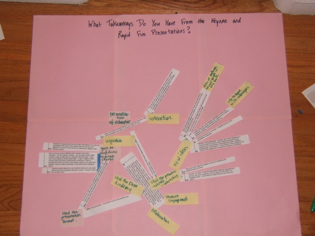
Over lunch, I went to the store and picked up a new ink cartridge so I could print out the survey responses. Once they were printed, I cut out each response on its own piece of paper, and started to organize them on the floor.
I started with just a handful of responses. Once those responses were organized, I added a few more, changing the emerging categories as necessary based on the new information contained in the responses.
This new method is proving to be much more fruitful than my original approach. The richness of the data is being retained, and I am able to see all of the information mapped out in front of me rather than being restricted to the limited view that my excel table had provided.


